…the gold/copper ratio:

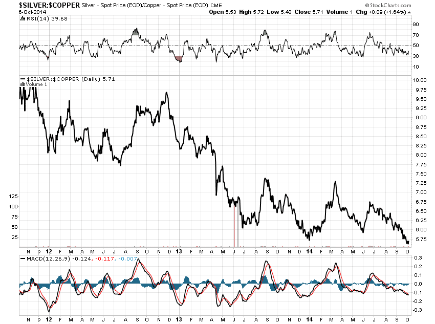
If you check the equivalent silver/copper chart (i just did) it’s now at its lowest ratio for the last three years. But gold and copper seem to be getting on better as friends. Best guess: demand for both is better than suspected.
Ah hey, why not? Here’s that slightly off-beat silver/copper chart too.
By-products of things people find useful have a tougher time altering supply. So, change the price.