This came to mind as I sat in front of the screen this morning and, once again, realized I had nothing to say about the state of junior mining, senior mining, metals or the market in general.
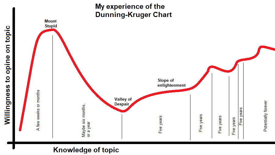
The basic shape of the chart is the one most of you have seen before, but there are two additions (and be clear these are personal ones, my sample size is one and it’s me). Firstly, the timescale goes on because I’m getting slower in adding any significant new layer of knowledge. Second, when the curve normally move up in a straight line to the right mine wobbles up and down (and in reality does multiple wobbles, I’ve just sketched in a couple) because even during the knowledge accumulation phase there are times when I’m more willing to blather on than others.
The reason the blog has been quiet recently is that I’m going through one of those wobbles somewhere on the right and am keenly aware I know nothing about mining. I’m quite sure that once my willingness to opine once again supersedes my knowledge of the topic (as it is bound to do at some point), posting frequency will pick up again.
Ignorance is bliss. Embrace the stupid.
PS: The classic Dunning-Kruger chart will also have the “plateau of sustainability” over on the right-hand side. I have no idea at all what that is.